Identifying and Displaying Issues in Public Health
through the use of Social Media and an Interactive Web Map
Sentiments on Twitter and our local surroundings
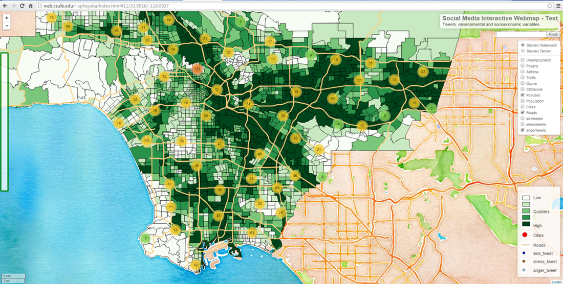
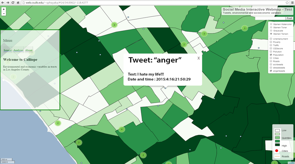
This project is focused on visualization and analysis relating 'big data' from social media (Twitter) regarding individuals' physical and emotional health to their local economic and environmental surroundings. We streamed millions of tweets geotagged in Los Angeles County using the Twitter API and python scripts during the spring of 2015. Text analysis methods were used to identify tweets related to physical and emotional health (e.g. happiness, sadness, anger, sickness, fatigue). The interactive web map was created with the open-source software QGIS, whereas the analysis was done with ArcMap and Stata. Link to webpage. [OBS! The webpage is currently down.]
Contributors:
Therese Norman
Wesley DeWitt
Sean Phayakapong
Contributors:
Therese Norman
Wesley DeWitt
Sean Phayakapong
|
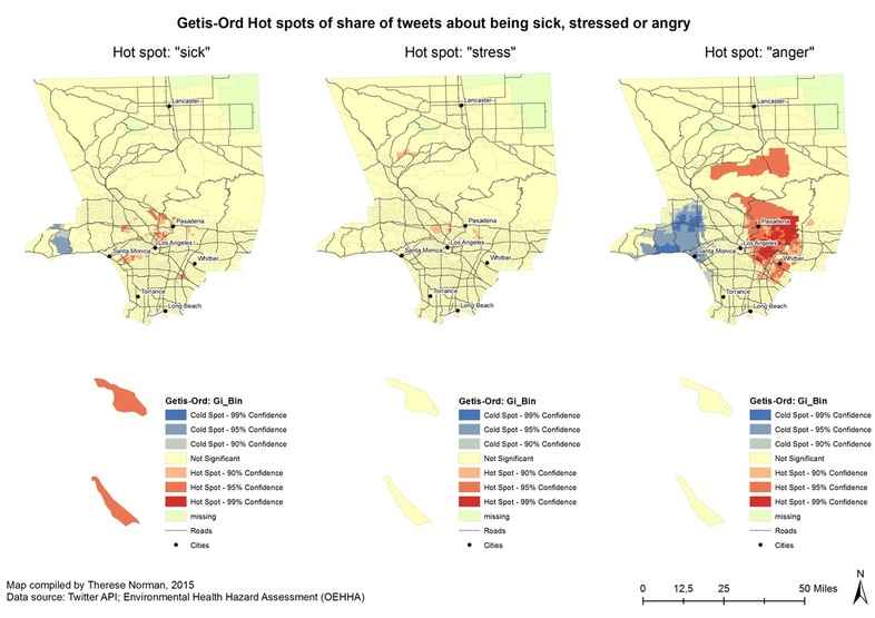
The maps show areas in LA County where there is a high concentration (hot spot) of tweets about feeling sick, stressed or angry or a low concentration (cold spot) of these tweets. The tweets were downloaded during four weeks in March-April 2015 through the Twitter API. |
|
|
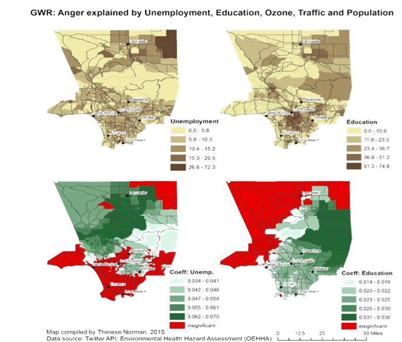
These maps show the results from geographically weighted regressions where the normalized prevalence of anger tweets are explained by unemployment, education, ozone level, traffic and population. The two top maps simply show unemployment rates and education (share of population without high school degree) per tract, whereas the two bottom maps show where unemployment has a significant correlation with anger tweets and where (lack of) education has a significant correlation with anger tweets. |
|
